
With the increase of mobile internet usage, Google is going to start favoring websites which are mobile friendly as of April 21, 2015. Google first announced this update would be coming since February, but in just a few hours, judgement day will come for your website. If your site isn’t mobile-friendly, you can kiss those rankings good-bye.
But if your website isn’t mobile friendly, you won’t be going down alone. There’s actually quite a few big brands that are expected to get burned also such as the BBC, David Beckham, Wikipedia and many which actually fail the mobile-friendly website tests.
Checking your Site?
If you’re not sure if your site is mobile friendly, you can use Google’s Mobile-Friendly Website Test. What you’ll get is a page which will either tell you your website is mobile friendly or not mobile friendly. You’ll either get a red or green notification telling you whether or not your website is mobile friendly such as what you see in the image below.
The Good News?
The update is aimed at mobile rankings. As far as we know, the update will not affect the desktop search results. So if your website’s traffic is primarily desktop based, you will be alright for now. However, this is not an excuse to put of updating your website.
From https://www.smartinsights.com/mobile-marketing/mobile-marketing-analytics/mobile-marketing-statistics/
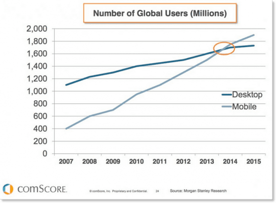
According to Smart Insights, there’s been a sharper increase in the amount of mobile internet users in comparison with desktop internet users. So yes, you’ll be okay for now. But in the future, your non-mobile friendly website will come around and bite you, especially if all your competitors have mobile-friendly websites and are stealing potential leads from you.
What are my options?
Responsive Website
This is a pretty good idea. It makes it easier for you to update your website since it’s the same website, just being morphed around on both mobile and desktop.
However, even though responsive themes are great and will pass Google’s mobile-friendly website test, some contact might not show very visibly, and some images might get cut off. So even though a responsive theme will save you when it comes to the search results, you might still lose out on potential conversions through your site.
Dedicated Mobile Website
This is a pretty good idea if you have a pretty good desktop website. This will save you the hassle of having to redesign your website. This is a process where you have a second website built specifically for mobile users.
An added benefit for a mobile site is that it allows you to actually control precisely what mobile users see in comparison to those on a desktop computer. It also gives you much more flexibility in really making your pages highly targeted to mobile users thus increasing your conversion rate for mobile-users.
Summary
If you have a website, it only makes sense to build it to be mobile-friendly or build a separate mobile friendly website. If most of your traffic is obtained from desktop users, you’ll be safe for now. But with the rise of mobile internet users, there is a lot of potential traffic and leads to be lost out on in the future by not having a mobile counterpart.
Comments are closed.